When I started applying for web development roles, I was asked in an interview about responsive design. I didn't know the answer so the interviewer explained to me what it was. His explanation wasn't really very good. He picked up his phone and said, 'it is a development technique that allows us to design a web interface so you can see the website like this', he said while holding his phone horizontally 'as well as this', and then moved his phone vertically. I didn't completely undestand what he meant but I found the topic interesting. I have now been working on reponsive websites for several months and have a better idea of how it works.
What is responsive design?
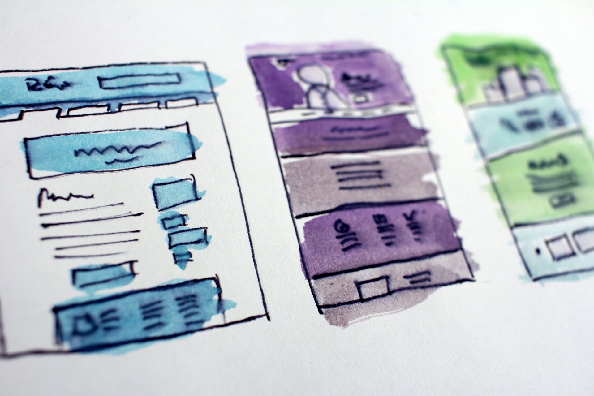
Responsive web design is an approach a designer takes to create a web page that resizes itself depending on the type of device or screen size it is being seen through. That could be a desktop computer monitor, a laptop or devices with small screens such as smartphones and tablets.
Responsive design has become an essential tool for anyone with a digital presence. With the growth of smartphones, tablets and other mobile computing devices, more people are using smaller-screens to view web pages.
Let’s take a traditional “unresponsive” website. When viewed on a desktop computer, for instance, the website might show three columns. But if you view that same layout on a smaller tablet, it might force you to scroll horizontally. When viewed from a smartphone, the website will probably be slow to load and much more difficult to read. Some elements might be hidden from view or distorted.
However, if a site uses responsive design, the tablet version may automatically adjust to display just two columns. That way, the content is readable and easy to navigate on the tablet. On a smartphone, the content might appear as a single column, perhaps stacked vertically. Images will resize instead of distorting the layout or getting cut off.
The point is: with responsive design, the website automatically adjusts based on the size of the screensize of the device the viewer sees it in.
Responsive design with Twitter Bootstrap
Bootstrap is a free and open-source front-end framework with a giant collection of handy, reusable bits of code written in HTML, CSS and Javascript, that enables developers and designers to quickly build fully responsive websites.
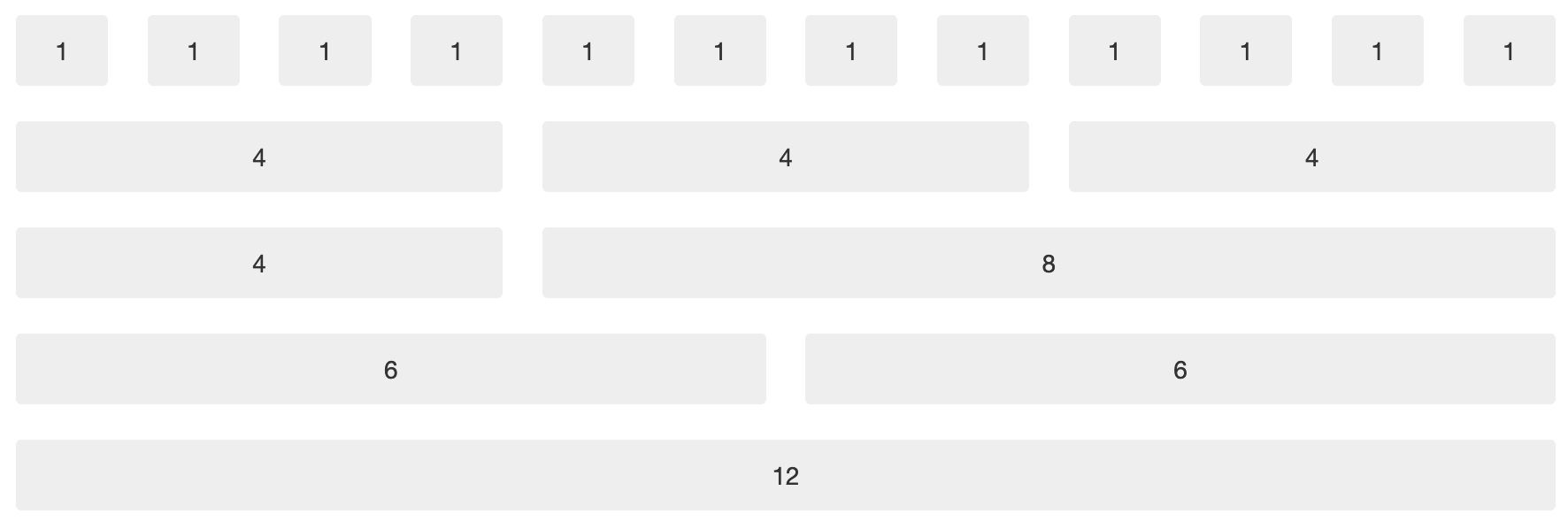
Bootstrap includes a responsive fluid grid system that appropriately scales up to 12 columns as the screen size increases. All page elements are sized by proportion, rather than pixels. The bootstrap Grid is used to define the width that each html component takes up on the page. Content elements can occupy at the least one column and at most 12.

To achieve this, bootstrap makes use of the following class names to specify the size of the content element:
.col-screensize-columnsize
For example col-md-4 stands for a column that scales down to medium screen that takes up 4 columns.
<div class="row">
	<div class="col-md-4">this width is 1/3 of the screen size</div>
	<div class="col-md-8">this width is 2/3 of the screen size</div>
</div>
These two columns will stack on smaller (mobile) and become 100% width.
Screen Sizes
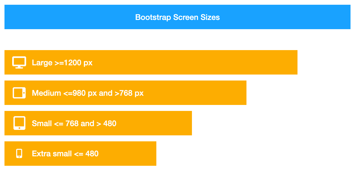
Screen sizes in bootstrap are defined by a range of width sizes in the following image:

The Media Queries
This behaviour is achieved through media queries, a feature of CSS3 that allows content rendering to adapt to different screen resolutions. The media queries used in Bootstrap are listed below. Each one goes in and changes the size of the columns to reflow the layout.
- @media (max-width: 480px)
- @media (max-width: 768px)
- @media (min-width: 768px) and (max-width: 980px)
- @media (max-width: 980px)
- @media (min-width: 980px)
- @media (min-width: 1200px)
Conclusion
Hopefully this overview of responsive web design and the Bootstrap framework has been useful. This is hardly scratching the surface of what Bootstrap is capable of. The web is full of tutorials on how to get started, starting by their documentation.
